J.K. Cement Limited Annual Report 2013-14
Annual Reports: Printed
|
| Client |
|
J.K. Cement Limited Foundation |
| Brand |
|
J.K. Cement |
| Agency |
|
AICL |
|
|
|
Brief
|
|
In a scenario where capital was protected and companies were cautious about new investments, J.K. Cement put in place and funded an aggressive expansion plan across their Grey and White Cement business. This would take them from 7 MT to 10MT in grey and 0.6 MT to 1.2 MT in white, along with a plant outside India. The annual report was expected to highlight the courage that these investments took! |
|
|
|
Cultural Context
|
|
The report design was based on creating an impact visually, but within the realm of corporate design, because the report needed to appeal to the sensitivities of large investors of the company from various parts of world. Therefore, we devised a strategy to make the design universal in its approach and for its content to be easily appreciated. |
|
|
|
Solution
|
|
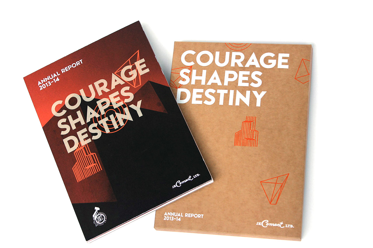
TThe hard case binding, the rugged cover and the bright pantone based printing together with laser etching on the cover made the report stand out and look bold, without being aggressive or arrogant. The boldness in design was married with strategic content and beautifully engaging panoramic photography of spanking new cement plants. The design referenced geometry to drive home execution excellence. |









.jpg)