Visual Identity Scheme for Startups
|
| Client |
|
Smriti Goyal / Neeti Goel |
| Brand |
|
La Bodega |
| Agency |
|
Studio Eksaat |
|
|
|
| Brand History |
|
La Bodega is a mexican restaurant which opened in Delhi in May 2014. It’s aim is to serve an authentic mexican experience to its customers through their local flavours and recipes. |
|
|
|
Brief
|
|
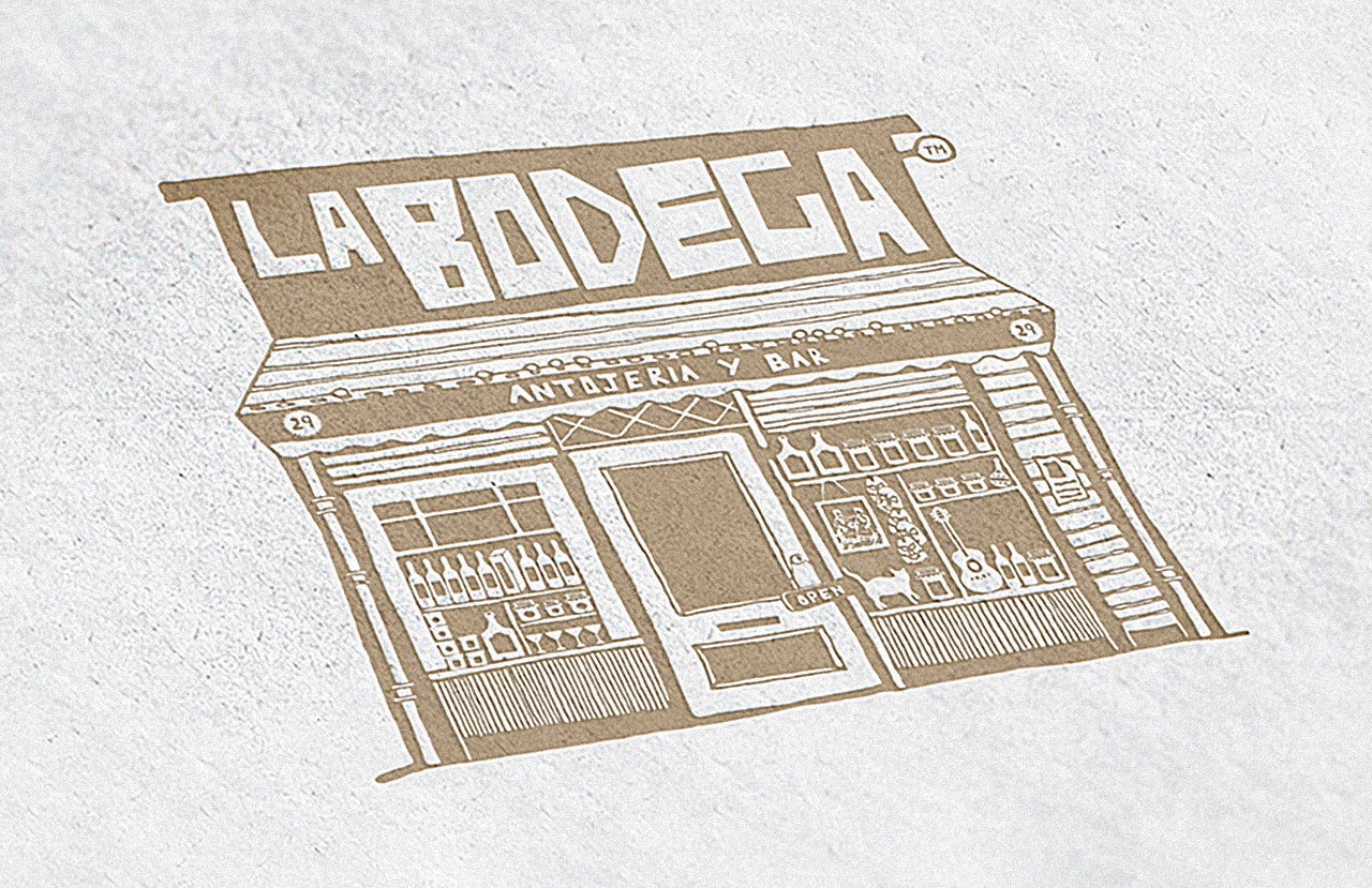
Objective: To bring authentic mexican food to Delhi.Brief: Bodega means ‘Shop’ in Spanish. Our brief was to create a logo which was bright, energetic, vibrant and true to the spirit and gusto of the mexican people. The client needed a logo unit which was flexible, with a variety of options tha could be used differently across different mediums and for different occasions.” |
|
|
|
Solution
|
|
We created an extensive main unit which depicted a grocery shop (Bodega) which was both warm and filled with curios and eats from Mexico.This unit was further simplified for the signage and the main logo. A five colour palette, individual icons and a custom hand-drawn font were also created to be used across the menu and other collaterals. |
|
|
|


.jpg)