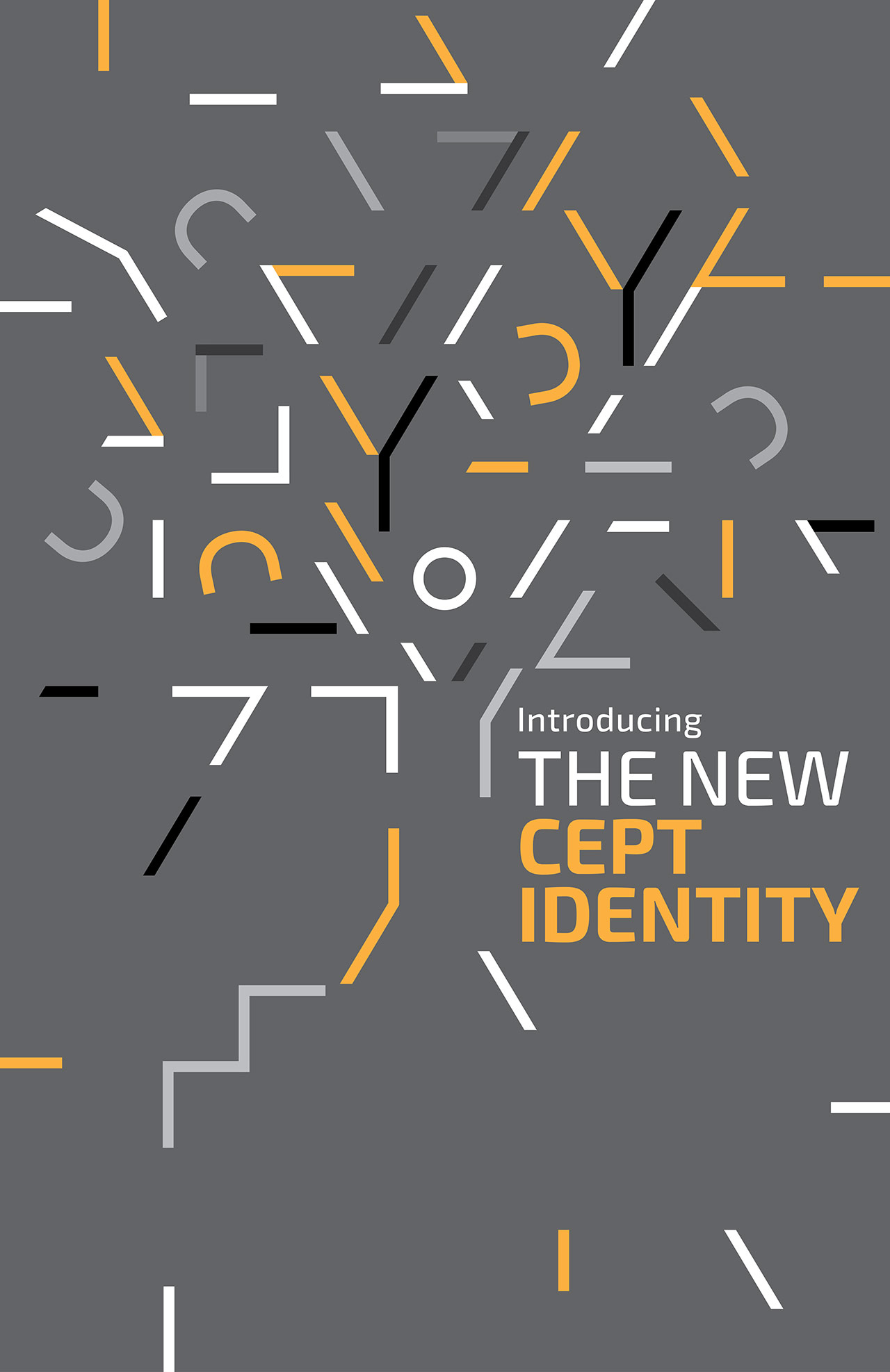
Branding (Re-Branding)/Visual Identity Scheme
|
| Client |
|
CEPT |
| Brand |
|
CEPT |
| Agency |
|
Wari Watai |
|
|
|
| Brand History |
|
CEPT takes its name from the acronym ‘Center for Environmental Planning and Technology’. It started as the School of Architecture in 1962 with a focus on design in the private realm. Subsequently in the span of four decades, it has added another 4 distinct faculties to reinforce the larger vision of the institution, eventually becoming a university in 2005. |
|
|
|
Brief
|
|
To develop a unique word mark to represent the CEPT University, one of India’s most prestigious and specialised university that imparts professional education programs to deepen the understanding of human settlements. The idea is to represent this new evolved CEPT University through a unique and an appropriate wordmark, projecting its vision and the essence of what the CEPT University is today. |
|
|
|
Solution
|
|
The distinct but complimentary visual character of the two words comes together as a unique visual statement. Its simple, yet has a distinct character. You can sense the seriousness & also the fun. Its quiet, calm & confident, also exuberant, energetic & dynamic. It is respectful of the past & also looks towards the future. The colours are inspired from Le Corbusier’s Polychromie Architecturale. |
|
|
|


.jpg)