| Illustration for Advertising | ||||
| Client | Yum Restaurant Marketing Pvt. Ltd. | |||
| Brand | KFC | |||
| Entrant | Ogilvy & Mather | |||
| Brief | In India, millions of underprivileged children look for food in trash cans and garbage piles, they live on leftovers. KFC launched a hunger initiative – Add Hope, and wanted to talk about it. KFC was providing a meal to underprivileged kids each time they sold a meal. They wanted a conversation around this initiative and if possible, invoke participation from people. | |||
| Scale & Location | This pan-India campaign connected to people all over the country. The posters were put up at KFC restaurants across India. | |||
| Solution |
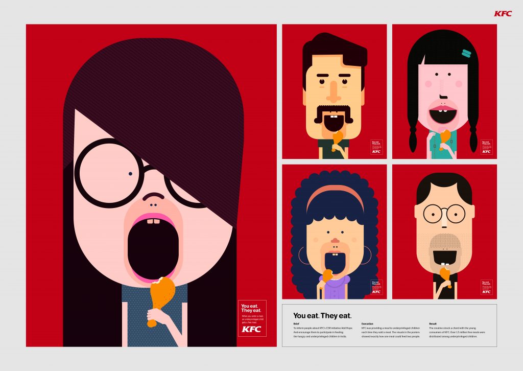
The poster design showed how one order can feed two people through a series of illustrations. Different characters of adults and kids and their combination made this design clever and intriguing. Also it explained the whole idea of the Add Hope initiative in a minimal fashion. | |||
| Insight | People are aware of the problem of malnutrition, but are unable to help as they don’t know any of proper channels through which they can help the needy | |||
